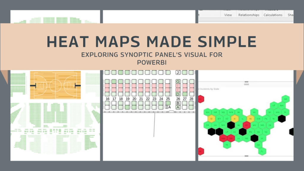
From pictorial product defect, production floor layout or transportation routes and fleet management, the ability to convert complex information in a simple yet powerful visual is invaluable. One tool that empowers users to achieve just that is Synoptic Panel by OKVIZ. With its intuitive interface and versatile features, Synoptic Panel opens doors to creating captivating heat maps and custom visuals, enabling users to provide insights and tell compelling data stories.
In this article, we’ll delve into the possibilities this tool offers, exploring how it can revolutionize your approach to data representation and analysis.
Please note that this is not a tutorial. However, I will provide you with the tools and resources so you can explore how to use this tool on your own. Should you have any questions, feel free to contact me.
What are the benefits of this tool
- Versatility: Create various visualizations including heat maps and custom visuals.
- Ease of Use: Intuitive interface for easy visualization creation.
- Integration: Seamless integration with popular data sources and platforms.
- Insight Generation: Uncover valuable insights through visually engaging representations.
The most common uses I’ve encountered include…
- Geographical mapping: visualize data by region or territory using heat maps
- Production floor lay-out heat mapping: Show critical areas and good performers.
- Pictorial Product Defect Map: Upload a product sketch and show where defects are allocated.
- Facility Management: Monitoring facility operations and resource usage by visualizing equipment status, maintenance needs, and energy consumption on building layout heat maps.
- Social Media Engagement: Analyzing social media engagement and audience demographics by visualizing metrics such as likes, shares, and comments on social media platform mock-up heat maps.
- Transportation Logistics: Optimizing transportation routes and fleet management by visualizing vehicle movements, delivery routes, and traffic congestion on geographical heat maps.
How-to
Links to review and use this tool by yourself:
Visual description: Synoptic Panel – OKVIZ
How to use tutorial: How to use Synoptic Panel – OKVIZ
Synoptic designer (Map your custom images): Synoptic Designer for Power BI
Synoptic Panel by OKVIZ is a game-changer for data visualization, offering endless options for businesses and professionals.
Whether you’re analyzing sales territories or optimizing production layouts, Synoptic Panel simplifies complex data into actionable insights. As organizations embrace data-driven strategies, Synoptic Panel is the go-to tool for unlocking valuable insights and driving smarter decisions.
EP


Leave a comment